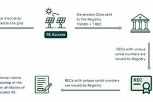
Visual representations of renewable energy systems can take many forms, from simple block diagrams illustrating the basic components of a solar photovoltaic system to complex Sankey diagrams depicting energy flow within a national grid incorporating multiple renewable sources. A schematic of a wind turbine, for example, might depict the nacelle, rotor blades, and generator, illustrating how mechanical energy converts into electricity. Similarly, a flowchart can represent the steps involved in biomass energy production, from feedstock cultivation to energy generation.
These visualizations are crucial for conveying complex information efficiently. They facilitate understanding of the various technologies, processes, and interconnections within renewable energy systems. Such clarity is essential for stakeholders across the spectrum, from policymakers and investors to engineers and educators. Historically, diagrams have played a vital role in communicating technical advancements, and their importance continues to grow as the world transitions towards more sustainable energy solutions. The ability to visualize complex systems fosters informed decision-making and accelerates the adoption of crucial technologies.
The following sections will delve deeper into specific examples of visualizations used in the renewable energy sector, exploring their applications and the insights they provide. Topics covered will include the role of diagrams in system design, performance analysis, and public awareness campaigns.
Tips for Effective Use of Visualizations in Renewable Energy
Clear and concise visualizations are critical for communicating the complexities of renewable energy systems. These tips offer guidance on creating and utilizing such visuals effectively.
Tip 1: Define the Purpose. Before creating a visualization, establish its objective. Is it intended to educate a general audience about solar energy or provide technical specifications to engineers designing a wind farm? The purpose will dictate the level of detail and complexity required.
Tip 2: Choose the Right Diagram Type. Different visualizations serve different purposes. A Sankey diagram is suitable for illustrating energy flow, while a schematic is better for depicting system components. Select the format that best conveys the intended information.
Tip 3: Prioritize Clarity and Simplicity. Avoid clutter and excessive detail. Focus on essential elements to ensure the visualization is easily understood by the target audience.
Tip 4: Use Consistent Labeling and Units. Maintain consistency in labels, units, and symbols throughout the visualization to avoid confusion and misinterpretation of data.
Tip 5: Incorporate Data Accurately. Ensure the data presented in the visualization is accurate and reflects reliable sources. Inaccurate data can lead to flawed conclusions and undermine the credibility of the visualization.
Tip 6: Consider Accessibility. Design visualizations with accessibility in mind. Use color palettes that are distinguishable to individuals with color blindness and provide alternative text descriptions for screen readers.
Tip 7: Cite Data Sources. When using data from external sources, provide clear citations to ensure transparency and allow for verification of information.
By following these tips, visualizations can be powerful tools for enhancing understanding and promoting the adoption of renewable energy technologies. Effective visuals bridge the gap between complex data and actionable insights, empowering stakeholders to make informed decisions.
In conclusion, the effective use of visualizations is integral to advancing the understanding and implementation of renewable energy solutions.
1. System Components
Accurate representation of system components is crucial for effective renewable energy diagrams. These diagrams serve as blueprints for understanding how different elements interact to generate clean energy. Clear visualization of these components aids in system design, troubleshooting, and communication among stakeholders.
- Energy Generation Units
These are the core components responsible for converting renewable resources into usable energy. Examples include photovoltaic cells in solar panels, wind turbine blades and generators, and geothermal power plants. Accurately depicting these units in a diagram clarifies the primary energy conversion process. For instance, a solar panel diagram might showcase individual cells, their wiring, and the protective layers, enabling viewers to grasp the internal workings.
- Energy Storage Systems
Many renewable energy sources are intermittent. Storage systems, such as batteries and pumped hydro facilities, address this intermittency. Diagrams benefit from illustrating the capacity and connection of these storage solutions within the overall system. A diagram might show how a battery bank connects to a solar array, visually explaining how excess energy is stored for later use.
- Power Conditioning Equipment
This equipment transforms the generated power into a usable form. Inverters, for example, convert direct current (DC) from solar panels into alternating current (AC) for grid compatibility. Transformers adjust voltage levels for efficient transmission and distribution. Clearly depicting these components in a diagram elucidates the power transformation stages. For instance, a diagram might show how an inverter connects to a solar panel array and the grid, illustrating the power flow and conversion.
- Transmission and Distribution Infrastructure
This network delivers the generated power to consumers. Transmission lines, substations, and smart grids are essential components. In a diagram, these elements demonstrate how renewable energy integrates into the existing power infrastructure. A regional energy diagram could illustrate how wind farms connect to transmission lines, supplying power to urban centers.
A comprehensive renewable energy diagram effectively integrates these system components, providing a holistic view of the entire energy generation, storage, conversion, and distribution process. Such diagrams are essential tools for education, planning, and implementation of renewable energy projects.
2. Energy Flow
Understanding energy flow is fundamental to the effective design and analysis of renewable energy systems. Visualizing this flow through diagrams provides crucial insights into system efficiency, losses, and overall performance. These diagrams serve as analytical tools for optimizing energy generation, distribution, and utilization.
- Energy Source to Generation
This facet depicts the initial energy capture. In a solar power system, the diagram would illustrate sunlight hitting photovoltaic panels and converting into direct current (DC) electricity. In a wind farm, the diagram would show wind driving turbine blades, generating mechanical energy that is subsequently converted into electricity. Visualizing this stage clarifies the primary energy conversion process and potential losses.
- Generation to Storage (if applicable)
If energy storage is incorporated, the diagram illustrates the flow of electricity to storage systems. This might involve depicting DC electricity from solar panels charging a battery bank. Alternatively, it could represent excess generated electricity being used to pump water uphill in a pumped hydro storage system. This visualization clarifies how surplus energy is conserved for later use, addressing the intermittency of renewable sources.
- Storage/Generation to Conversion and Conditioning
This stage involves converting the generated or stored energy into a usable form. Diagrams often depict inverters transforming DC electricity into alternating current (AC) for grid compatibility or transformers adjusting voltage levels for efficient transmission. This visual representation elucidates the steps required to prepare the energy for end-use.
- Transmission and Distribution to End-Users
The final facet illustrates the delivery of electricity to consumers. Diagrams might depict transmission lines carrying electricity from a solar farm to a substation, then to residential or industrial users. This visualization helps understand the path of energy and potential losses during transmission and distribution. It can also highlight the integration of renewable energy sources into the wider electricity grid.
By effectively visualizing these stages, energy flow diagrams provide a comprehensive understanding of renewable energy system operation. They enable analysis of energy conversion efficiency at each stage, identification of potential bottlenecks, and optimization of system design for maximum energy delivery and utilization. This clear visualization is essential for both technical experts and broader audiences interested in understanding the complexities of renewable energy systems.
3. Process Visualization
Process visualization plays a crucial role in understanding the complexities of renewable energy systems. By representing the steps involved in energy generation, conversion, and distribution, these diagrams facilitate clearer communication, improved system design, and more effective troubleshooting. They provide a visual roadmap of the entire energy journey, from source to consumption.
- Resource Acquisition
This initial stage depicts how the renewable resource is obtained. For solar energy, this might involve illustrating sunlight reaching photovoltaic panels. For geothermal, it could depict drilling into the earth to access heat. A biomass diagram might show the harvesting and processing of organic matter. Visualizing this stage highlights the resource dependency of each renewable energy type and the environmental impact of resource acquisition.
- Energy Conversion
This stage illustrates the core process of transforming the renewable resource into usable energy. For solar, the diagram would show sunlight converted into direct current (DC) electricity by photovoltaic cells. Wind energy diagrams would depict the conversion of wind’s kinetic energy into mechanical energy, then into electricity. Hydroelectric diagrams would illustrate water driving turbines. This visualization clarifies the specific technologies and processes involved in energy conversion.
- Energy Conditioning and Storage
This stage depicts any necessary modifications to the generated energy before distribution. It might involve illustrating inverters converting DC electricity to AC for grid compatibility, or transformers adjusting voltage levels. It could also show energy storage mechanisms, such as batteries or pumped hydro systems, storing surplus energy. This visualization helps understand how intermittency is addressed and how energy is prepared for efficient distribution.
- Energy Distribution and Utilization
The final stage illustrates how the energy reaches end-users. This might involve diagrams depicting transmission lines, substations, and smart grids. It could also illustrate the various applications of the energy, such as powering homes, businesses, or transportation systems. Visualizing this stage clarifies the infrastructure required for energy delivery and the diverse uses of renewable energy.
Effective process visualization within renewable energy diagrams enables stakeholders to grasp complex systems at a glance. This clarity fosters informed decision-making, promotes better system design, and ultimately accelerates the transition towards sustainable energy solutions. By breaking down complex processes into digestible visual representations, these diagrams serve as invaluable tools for education, communication, and problem-solving in the renewable energy sector.
4. Data Representation
Effective data representation is crucial for conveying complex information within renewable energy diagrams. Accurate and insightful visualization of data allows stakeholders to grasp key performance indicators, trends, and potential areas for optimization within renewable energy systems. This facilitates informed decision-making, improved system design, and more effective communication among experts and the public.
- Energy Production Metrics
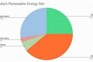
Visualizing energy production data is essential for assessing system performance. Diagrams might employ line graphs to display energy output over time, bar charts to compare the output of different renewable sources, or area charts to show the contribution of each source to the total energy mix. Representing data in this way enables stakeholders to track progress towards energy goals, identify seasonal variations, and assess the overall effectiveness of the renewable energy system. For example, a solar farm diagram might display daily energy generation, highlighting peak production hours and total daily output.
- Environmental Impact Indicators
Renewable energy systems offer significant environmental benefits. Data representation can effectively showcase these benefits by visualizing reductions in greenhouse gas emissions, water usage, or land use compared to conventional energy sources. This data can be presented through charts, infographics, or maps to demonstrate the positive environmental impact of transitioning to renewable energy. For example, a wind farm diagram could include data on avoided carbon dioxide emissions, quantifying the environmental benefits of the project.
- Financial Performance Data
Economic considerations are crucial for renewable energy projects. Diagrams can incorporate financial data to illustrate return on investment, cost savings, and the financial viability of renewable energy systems. This data can be presented using charts and graphs to showcase the economic benefits of investing in clean energy technologies. For example, a solar panel installation diagram could include data on electricity bill savings over time, demonstrating the financial advantages of solar power.
- System Efficiency and Reliability Metrics
Data representation can visually communicate the efficiency and reliability of renewable energy systems. Diagrams can incorporate metrics such as capacity factor, uptime percentage, and performance ratio to provide insights into system performance and stability. This data can be visualized through gauges, meters, or heat maps to highlight areas for improvement and ensure optimal system operation. For example, a geothermal power plant diagram could display the plant’s capacity factor, indicating the percentage of time it operates at full capacity.
By effectively integrating these data representations, renewable energy diagrams become powerful tools for conveying complex information concisely. This enhances understanding of system performance, environmental impact, and financial viability, facilitating informed decision-making and promoting the wider adoption of renewable energy technologies. The clear presentation of data is crucial for bridging the gap between technical details and actionable insights, empowering stakeholders to embrace sustainable energy solutions.
5. Clarity and Accuracy
Clarity and accuracy are paramount in renewable energy diagrams. These diagrams serve as critical communication tools for a diverse audience, including engineers, policymakers, investors, and the public. A lack of clarity can lead to misinterpretations of system functionality, hindering effective design and implementation. Inaccurate information can mislead decision-making processes, potentially resulting in inefficient systems or flawed investment strategies. For instance, a diagram misrepresenting the energy output of a solar farm could lead to overestimation of its capacity, resulting in unmet energy demands. Similarly, a schematic with unclear component labels can impede troubleshooting efforts during system maintenance. The consequences of ambiguity or misinformation can range from minor inefficiencies to significant financial losses.
The practical significance of clarity and accuracy extends beyond technical functionality. Clear diagrams play a vital role in public awareness campaigns, fostering understanding and acceptance of renewable energy technologies. Accurate visualizations of environmental benefits, such as reduced carbon emissions, can empower informed public discourse and support policy decisions. Moreover, clear and accurate diagrams build trust among investors, demonstrating the viability and transparency of renewable energy projects. Consider a wind farm project proposal: a diagram clearly illustrating the projected energy output, cost analysis, and environmental impact strengthens the investor’s confidence in the project’s feasibility.
In conclusion, clarity and accuracy in renewable energy diagrams are not merely aesthetic considerations but essential elements for successful project development and broader adoption of sustainable energy solutions. These qualities underpin effective communication, informed decision-making, and public trust, paving the way for a smoother transition towards a cleaner energy future. Challenges such as representing complex data in a simplified format and ensuring accessibility for diverse audiences necessitate ongoing efforts to refine visualization techniques and uphold rigorous standards of accuracy. This commitment to clarity and accuracy is crucial for realizing the full potential of renewable energy technologies and achieving a sustainable energy landscape.
Frequently Asked Questions
This section addresses common inquiries regarding visualizations of renewable energy systems, aiming to clarify their purpose, application, and interpretation.
Question 1: What is the primary purpose of a renewable energy diagram?
Visualizations serve to elucidate complex processes, system components, and data related to renewable energy, facilitating understanding for both technical experts and the general public. They can depict system designs, energy flow, or performance metrics, aiding in analysis and communication.
Question 2: How do different diagram types contribute to understanding renewable energy?
Various diagram types offer unique perspectives. Schematics illustrate system components and their interconnections. Flowcharts depict processes step-by-step. Sankey diagrams visualize energy flow and losses. The appropriate diagram type depends on the specific information being conveyed.
Question 3: What are key considerations for interpreting data presented in these diagrams?
Accurate interpretation requires attention to units, scales, and the context of the data. Understanding the methodology behind data collection and the limitations of the visualization is crucial for drawing valid conclusions. Consulting reputable sources and seeking expert interpretation when necessary is advised.
Question 4: How can visualizations aid in the design and optimization of renewable energy systems?
Diagrams can represent proposed system layouts, enabling engineers to optimize component placement and energy flow. Simulations incorporating real-world data can predict system performance under various conditions, informing design choices for maximum efficiency and reliability.
Question 5: What role do visualizations play in communicating the benefits of renewable energy to the public?
Accessible visuals can effectively communicate the environmental and economic advantages of renewable energy to non-technical audiences. Charts illustrating reduced carbon emissions or infographics comparing energy costs can promote public understanding and support for sustainable energy initiatives.
Question 6: How can one ensure the accuracy and reliability of information presented in renewable energy diagrams?
Data should be sourced from reputable institutions and studies. Transparency in data collection and processing methods is crucial. Peer review and verification by independent experts enhance credibility. Using standardized symbols and terminology improves clarity and reduces the risk of misinterpretation.
Understanding these visualizations empowers stakeholders to make informed decisions regarding renewable energy adoption and implementation. Critical evaluation of data sources and diagram types ensures accurate interpretation and contributes to meaningful dialogue about sustainable energy solutions.
For further exploration, the following section provides case studies demonstrating the practical applications of renewable energy diagrams in real-world projects.
Conclusion
Visualizations of renewable energy systems, encompassing diverse formats from schematic diagrams of individual components to system-level flowcharts illustrating energy distribution, constitute essential tools for understanding, designing, and implementing sustainable energy solutions. Effective use of these diagrams requires careful consideration of the target audience, the specific information being conveyed, and the chosen visualization method. Accuracy, clarity, and appropriate data representation are paramount for ensuring effective communication and informed decision-making. The exploration of various diagram types, data visualization techniques, and best practices for clarity and accuracy underscores the crucial role visualizations play in advancing renewable energy adoption.
As the global transition towards sustainable energy intensifies, the importance of clear and accurate communication regarding complex systems cannot be overstated. Precise and accessible visualizations empower stakeholders across various sectors, fostering collaboration, innovation, and accelerated progress towards a cleaner energy future. Continued development of sophisticated visualization techniques, coupled with rigorous data analysis, will be instrumental in optimizing renewable energy systems and realizing their full potential in mitigating climate change and ensuring long-term energy security.


