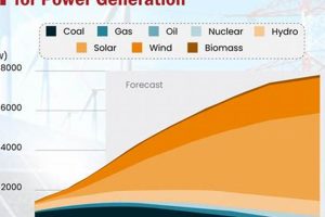
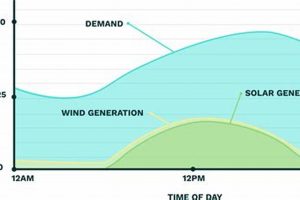
Visual representations of renewable energy’s environmental impact, such as graphs and diagrams, can illuminate various metrics. These might include greenhouse gas emission reductions compared to fossil fuels, land use changes associated with different renewable technologies, or water consumption for energy production. For example, a bar graph could compare the carbon dioxide emissions per kilowatt-hour of electricity generated from solar, wind, and coal power.
Such visualizations offer accessible and compelling insights into the complex relationship between energy choices and environmental outcomes. They facilitate informed decision-making by policymakers, investors, and the public, promoting a deeper understanding of the trade-offs and benefits associated with transitioning to sustainable energy systems. Historically, the absence of readily available and understandable data hampered public discourse on energy and the environment. Modern data visualization techniques now offer powerful tools for transparency and engagement on this critical issue.
Exploring the diverse impacts of specific renewable energy sources requires detailed analysis and careful interpretation of available data. Subsequent sections will delve into the environmental footprint of individual renewable technologies and assess their overall contribution to a sustainable future.
Tips for Understanding Visualizations of Renewable Energy’s Environmental Impact
Effective interpretation of charts and graphs depicting the environmental effects of renewable energy requires careful consideration of several factors. The following tips offer guidance for navigating these visualizations and extracting meaningful insights.
Tip 1: Consider the Data Source: Reputable sources, such as government agencies, academic institutions, and established research organizations, lend credibility to the data presented. Scrutinize the source’s methodology and potential biases.
Tip 2: Pay Attention to Units and Scales: Different units and scales can drastically alter the perception of impact. Ensure comparisons are made using consistent metrics and appropriately scaled axes.
Tip 3: Look Beyond Single Metrics: Environmental impact assessments should encompass a range of factors, not just a single metric like carbon emissions. Consider water usage, land use change, and potential impacts on biodiversity.
Tip 4: Differentiate Between Absolute and Relative Values: Absolute values represent raw data, while relative values express data as a proportion or percentage. Both are valuable for comprehensive understanding.
Tip 5: Account for Geographic and Temporal Variations: The environmental impact of a given renewable energy technology can vary significantly depending on location and time frame. Consider the specific context presented in the visualization.
Tip 6: Be Aware of Potential Data Gaps: Data limitations can influence the scope and accuracy of visualizations. Acknowledge any uncertainties or missing information.
Tip 7: Compare Across Different Renewable Energy Sources: Visualizations often enable comparisons between different renewable energy technologies. Leverage this to understand the relative advantages and disadvantages of each.
By applying these tips, one can gain a more nuanced and comprehensive understanding of the environmental implications of renewable energy technologies, facilitating informed discussions and decisions about sustainable energy transitions. These insights form the foundation for a more robust and evidence-based approach to evaluating energy choices.
Ultimately, a comprehensive understanding of renewable energy’s environmental impact requires careful analysis of available data and consideration of the broader context. The following conclusion synthesizes key findings and offers perspectives on future directions.
1. Data Visualization
Data visualization plays a crucial role in understanding the environmental impacts of renewable energy. Effective visualizations transform complex datasets into accessible formats, facilitating informed decision-making. Charts, graphs, and maps can illustrate the lifecycle emissions of different energy sources, land use requirements, water consumption, and other critical environmental factors. For example, a stacked bar chart can effectively compare the greenhouse gas emissions associated with coal, natural gas, solar, and wind power throughout their respective lifecycles, from resource extraction to decommissioning. Visualizing such data enables stakeholders to quickly grasp the relative environmental advantages of renewable energy technologies.
Furthermore, data visualization can reveal geographic variations in the environmental performance of renewables. Maps, for instance, can depict the areas most suitable for wind or solar energy development based on factors like wind speed and solar irradiance. This spatial analysis enables optimized siting of renewable energy infrastructure, minimizing environmental disruption and maximizing energy output. Interactive visualizations allow users to explore data dynamically, filtering by specific criteria or zooming in on areas of interest. Such tools empower researchers, policymakers, and the public to engage with environmental data directly, fostering deeper understanding and promoting data-driven decision-making.
Effective data visualization necessitates careful consideration of chart type, data scaling, and color palettes to avoid misrepresenting information. Transparency regarding data sources and methodologies is essential for maintaining credibility and fostering trust. While challenges remain in standardizing data collection and reporting across the renewable energy sector, advancements in data visualization techniques continue to improve accessibility and enhance our understanding of the complex interplay between energy choices and environmental outcomes.
2. Environmental Impact
Assessing environmental impact is crucial for understanding the role of renewable energy in achieving sustainability. Charts visualizing this impact provide a powerful tool for comparing different renewable energy sources and understanding their potential benefits and drawbacks. These visualizations facilitate informed decision-making regarding energy policies and investments by presenting complex data in an accessible format.
- Greenhouse Gas Emissions
A primary driver for transitioning to renewable energy is reducing greenhouse gas emissions. Charts can effectively illustrate the comparative emissions of various energy sources, highlighting the significantly lower carbon footprint of renewables like solar and wind compared to fossil fuels. These visualizations can track emissions reductions over time, demonstrating the effectiveness of renewable energy implementation in mitigating climate change.
- Land Use Change
Renewable energy technologies require land for infrastructure such as solar farms, wind turbines, and hydroelectric dams. Charts can depict the land use requirements of different renewable energy sources, enabling comparisons and informed choices regarding land management. Visualizations can also highlight potential land use conflicts, such as impacts on agriculture or natural habitats, facilitating strategies to minimize environmental disruption.
- Water Consumption
Certain renewable energy technologies, such as hydroelectric power and some concentrated solar power plants, require significant water resources. Charts can depict water consumption rates for different renewable energy sources, allowing for comparisons and assessment of potential water stress in specific regions. Visualizing water usage alongside energy generation can inform decisions regarding water resource management and sustainable energy development.
- Ecosystem Impacts
While generally considered environmentally beneficial, renewable energy technologies can have localized impacts on ecosystems. Charts can visualize these impacts, including habitat alteration, bird and bat mortality from wind turbines, and changes in water flow patterns from hydroelectric dams. Such visualizations enable informed discussions about mitigating these impacts through careful siting, technological advancements, and ecosystem restoration efforts.
By visualizing these various facets of environmental impact, charts provide a comprehensive perspective on the trade-offs and benefits associated with different renewable energy technologies. These visualizations are essential tools for fostering transparency, promoting evidence-based decision-making, and driving progress toward a sustainable energy future. Further analysis can incorporate lifecycle assessments, comparing the total environmental impact of renewable energy sources from manufacturing to decommissioning, providing a more complete understanding of their overall sustainability.
3. Renewable Energy Sources
Understanding the environmental impact of renewable energy requires a nuanced examination of individual energy sources. Charts visualizing this impact provide crucial insights into the specific benefits and trade-offs associated with each renewable technology, facilitating informed comparisons and data-driven decision-making. Exploring diverse renewable energy sources within this context illuminates their unique contributions to a sustainable energy future.
- Solar Power
Solar power harnesses sunlight using photovoltaic cells or concentrated solar power systems. Charts can depict the land use requirements of solar farms, comparing them to conventional power plants. Lifecycle assessments visualized through charts can quantify the environmental impact of solar panel production, transportation, installation, and eventual disposal, offering a comprehensive view of solar energy’s sustainability. Furthermore, visualizations can illustrate the reduction in greenhouse gas emissions achieved through solar power adoption, highlighting its contribution to climate change mitigation.
- Wind Power
Wind power converts wind energy into electricity using wind turbines. Charts can visualize the capacity factors of wind farms in different locations, demonstrating the influence of wind resource availability on energy output. Visualizations can also depict potential impacts on wildlife, such as bird and bat mortality, enabling informed discussions about siting and mitigation strategies. Furthermore, lifecycle assessments presented in chart form can compare the environmental footprint of wind turbine manufacturing and disposal to that of fossil fuel-based electricity generation.
- Hydropower
Hydropower utilizes the energy of flowing water to generate electricity. Charts can illustrate the water consumption and reservoir area associated with hydroelectric dams, highlighting potential impacts on aquatic ecosystems and water resources. Visualizations can also depict the displacement of communities and alteration of river flow regimes caused by dam construction, facilitating comprehensive assessments of hydropower’s environmental and social consequences. Comparative charts can showcase the greenhouse gas emissions profiles of hydropower compared to other renewable and non-renewable energy sources.
- Geothermal Energy
Geothermal energy harnesses heat from the Earth’s interior for direct use or electricity generation. Charts can visualize the land use requirements and potential for induced seismicity associated with geothermal power plants. Visualizations can also depict the lifecycle emissions of geothermal energy, demonstrating its relatively low carbon footprint. Furthermore, charts can illustrate the varying geothermal resource potential across different geographic regions, informing decisions regarding resource exploration and development.
Analyzing individual renewable energy sources through charts allows for a deeper understanding of their diverse environmental profiles. This nuanced perspective, facilitated by data visualization, enables more informed decision-making regarding sustainable energy transitions, fostering a balanced approach to maximizing environmental benefits while minimizing potential drawbacks. Integrating these insights into broader energy policy discussions promotes evidence-based strategies for achieving a sustainable energy future.
4. Comparative Analysis
Comparative analysis is essential for interpreting charts on how renewable energy affects the environment. It provides a framework for evaluating the relative merits and drawbacks of different renewable energy sources, enabling informed decisions regarding sustainable energy transitions. By juxtaposing environmental impacts across various technologies, comparative analysis illuminates the trade-offs inherent in energy choices and guides the development of effective energy policies.
- Inter-Technology Comparisons
Comparing different renewable energy technologies, such as solar, wind, hydro, and geothermal, reveals their varying environmental footprints. Charts can visualize these differences, depicting land use requirements, water consumption, greenhouse gas emissions, and potential impacts on ecosystems. For example, comparing the lifecycle emissions of solar photovoltaics to those of hydropower can inform decisions regarding resource allocation and technology prioritization.
- Renewable vs. Non-Renewable Comparisons
Juxtaposing the environmental impacts of renewable energy sources with those of fossil fuels highlights the environmental benefits of transitioning to cleaner energy systems. Charts can illustrate the stark contrast in greenhouse gas emissions between renewable and non-renewable sources, underscoring the urgency of climate change mitigation. Furthermore, comparative analysis can reveal the differences in air and water pollution associated with each energy type, providing a comprehensive perspective on environmental health impacts.
- Geographic Context
Comparative analysis within a geographic context reveals regional variations in the environmental performance of renewable energy technologies. For instance, charting the water consumption of concentrated solar power plants in arid regions versus hydropower generation in water-rich areas can inform decisions about appropriate technology deployment based on local environmental constraints. Such geographically specific comparisons are crucial for optimizing renewable energy integration and minimizing adverse environmental consequences.
- Temporal Trends
Analyzing changes in environmental impacts over time allows for the assessment of progress toward sustainability goals. Charts can track the reduction in greenhouse gas emissions achieved through renewable energy deployment, demonstrating the effectiveness of policy interventions and technological advancements. Temporal comparisons can also reveal the evolving environmental footprint of renewable energy technologies as innovation drives improvements in efficiency and reduces manufacturing impacts.
Through these comparative analyses, charts on renewable energy’s environmental impact become powerful tools for evidence-based decision-making. By facilitating a nuanced understanding of the trade-offs and benefits associated with different energy choices, comparative analysis empowers stakeholders to navigate the complexities of sustainable energy transitions and contribute to a more environmentally sound future. This approach fosters informed discussions and promotes data-driven solutions for achieving global sustainability objectives.
5. Trend Identification
Trend identification within charts visualizing the environmental impact of renewable energy sources provides crucial insights for strategic decision-making and policy development. Analyzing temporal changes in key environmental metrics, such as greenhouse gas emissions, land use, and water consumption, reveals the effectiveness of renewable energy implementation and informs future strategies for sustainable energy transitions. For example, declining trends in carbon dioxide emissions correlated with increasing renewable energy capacity demonstrate the positive impact of renewable energy adoption on climate change mitigation. Similarly, trends in land use change associated with different renewable energy technologies can inform land management practices and minimize environmental disruption.
Examining trends also allows for the identification of emerging challenges and opportunities within the renewable energy sector. For instance, increasing water consumption trends in regions with growing concentrated solar power capacity may necessitate the development of water-efficient technologies or alternative cooling systems. Conversely, downward trends in the cost of solar photovoltaic panels, visualized through charts, can signal opportunities for accelerated deployment and increased market penetration. Identifying these trends enables proactive responses, optimizing resource allocation, and maximizing the environmental benefits of renewable energy.
Understanding long-term trends is fundamental for projecting future scenarios and formulating effective energy policies. Analyzing historical data on renewable energy deployment, technological advancements, and environmental impacts allows for the development of predictive models and informed projections of future energy needs and environmental outcomes. This foresight is crucial for guiding investments in research and development, infrastructure development, and policy frameworks that support the continued growth and positive environmental impact of the renewable energy sector. Trend identification, therefore, serves as a critical tool for navigating the complexities of sustainable energy transitions and ensuring a more environmentally sound future. It facilitates evidence-based decision-making and promotes proactive strategies for mitigating environmental challenges while maximizing the benefits of renewable energy resources.
Frequently Asked Questions
The following questions and answers address common inquiries regarding the use of charts to understand the environmental impacts of renewable energy.
Question 1: How can charts effectively communicate the complex environmental impacts of renewable energy?
Charts distill complex data into visually accessible formats, enabling rapid comprehension of key environmental metrics. Visualizations such as lifecycle assessments presented in chart form facilitate comparisons across different energy sources and highlight the relative advantages of renewables.
Question 2: What types of environmental impacts are typically visualized in these charts?
Charts can visualize a range of impacts, including greenhouse gas emissions, land use change, water consumption, and potential effects on ecosystems. These visualizations enable comprehensive assessments of the environmental trade-offs associated with different renewable energy technologies.
Question 3: How can charts be used to compare the environmental performance of different renewable energy sources?
Comparative charts facilitate direct comparisons between renewable energy technologies, such as solar, wind, and hydro. These visualizations can depict differences in land use, water usage, and emissions, enabling informed decisions regarding technology selection and resource allocation.
Question 4: What are the limitations of using charts to assess environmental impact?
Data availability and quality can influence the accuracy and scope of visualizations. Furthermore, charts may oversimplify complex environmental interactions, necessitating careful interpretation and consideration of broader contextual factors.
Question 5: How can trend identification in charts inform renewable energy policy and investment decisions?
Analyzing temporal trends in environmental impacts, such as decreasing emissions or increasing land use, reveals the effectiveness of current policies and informs future strategies. Trend identification can also highlight emerging challenges and opportunities, guiding investment decisions and promoting proactive solutions.
Question 6: Where can reliable data and visualizations on the environmental impacts of renewable energy be found?
Reputable sources for data and visualizations include government agencies, academic institutions, international organizations, and established research institutions specializing in energy and environmental analysis.
Understanding the environmental impacts of renewable energy requires careful consideration of data visualized in charts and graphs. Scrutinizing data sources, methodologies, and potential biases is essential for informed interpretation.
Further exploration of specific renewable energy technologies and their respective environmental footprints is crucial for informed decision-making and the development of sustainable energy strategies.
Conclusion
Visualizations of renewable energy’s environmental effects provide crucial insights for sustainable energy transitions. Analysis of these visualizations reveals the complex interplay between energy choices and environmental outcomes, highlighting the comparative advantages and disadvantages of various renewable technologies. Careful examination of lifecycle assessments, land use change, water consumption, and greenhouse gas emission reductions informs effective policy development and promotes informed decision-making regarding resource allocation and technology prioritization.
The transition to a sustainable energy future necessitates ongoing data collection, analysis, and transparent communication. Continued refinement of visualization techniques and access to reliable data empowers stakeholders to navigate the complexities of energy choices and contribute to a more environmentally sound future. Objective assessment of renewable energy’s environmental impact, facilitated by robust data visualization, remains essential for achieving global sustainability objectives.


