Visual representations of data related to sustainable power sources, such as solar, wind, hydro, and geothermal energy, take many forms. These can include charts illustrating energy production trends, diagrams explaining how different technologies work, or infographics comparing the environmental impact of various energy options. A visualization might depict the growth of solar panel installations over time or the reduction in carbon emissions achieved through wind power.
Effective visualizations are crucial for communicating complex information about sustainable power generation clearly and concisely. They can help policymakers make informed decisions, educate the public about the benefits of transitioning to cleaner energy sources, and encourage investment in renewable energy technologies. Historically, the lack of easily digestible information has hindered public understanding and support for these crucial technologies. Visualizations now play a key role in bridging this gap and accelerating the shift toward a sustainable energy future.
This discussion will further explore the diverse applications of these visuals, examining specific examples and analyzing their effectiveness in different contexts. Topics covered will include the role of visualizations in policymaking, public awareness campaigns, and investor relations, as well as the evolving best practices for creating impactful and accurate representations of sustainable energy data.
Tips for Effective Visualizations of Sustainable Energy Data
Creating impactful visuals requires careful consideration of the target audience and the specific message being conveyed. The following tips offer guidance on developing effective representations of data related to sustainable power sources.
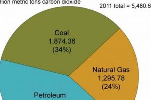
Tip 1: Choose the Right Chart Type: Different chart types are suited to different data sets and narratives. Line charts effectively illustrate trends over time, while bar charts compare discrete values. Pie charts show proportions of a whole, and scatter plots reveal correlations between variables. Selecting the appropriate chart type ensures data clarity.
Tip 2: Simplify and Declutter: Avoid visual overload. Keep charts clean and focused by eliminating unnecessary elements, such as excessive gridlines or distracting background patterns. Prioritize essential information for enhanced comprehension.
Tip 3: Use Clear and Concise Labels: Ensure all axes, data points, and legends are clearly labeled with descriptive and easy-to-understand text. Proper labeling removes ambiguity and promotes accurate interpretation.
Tip 4: Employ a Consistent Color Palette: A consistent and visually appealing color scheme enhances readability and reinforces key messages. Limit the number of colors used and ensure sufficient contrast for accessibility.
Tip 5: Provide Context and Interpretation: Data visualizations should not stand alone. Accompany charts with concise explanations and interpretations to guide the audience’s understanding and highlight key takeaways.
Tip 6: Cite Data Sources: Build credibility by citing the sources of data used in the visualizations. This allows for verification and fosters trust in the information presented.
Tip 7: Consider Accessibility: Design visualizations that are accessible to individuals with visual impairments. Use sufficient color contrast, alternative text descriptions, and clear font sizes to ensure inclusivity.
By following these guidelines, visualizations can effectively communicate complex information about sustainable power, enabling informed decision-making and fostering broader public understanding.
The subsequent conclusion will synthesize the key insights discussed and offer perspectives on the future of visualizations in the renewable energy sector.
1. Data Visualization
Data visualization plays a crucial role in conveying complex information about renewable energy sources effectively. Transforming raw datasuch as energy generation statistics, cost analyses, and environmental impact assessmentsinto visually compelling formats allows stakeholders to grasp key insights quickly. This is particularly important in the renewable energy sector, where technical details and long-term projections can be challenging for non-experts to understand. For example, visualizing the growth of solar energy capacity over time through a line graph can demonstrate the increasing viability of this technology more effectively than presenting the same data in a table. Similarly, a map displaying the distribution of wind farms across a region can highlight the spatial aspects of renewable energy deployment, revealing patterns and potential challenges.
Visual representations facilitate comparisons between different renewable energy sources, enabling informed decision-making. A stacked bar chart, for instance, could compare the levelized cost of energy for solar, wind, and hydro power, enabling policymakers and investors to evaluate the economic competitiveness of each option. Furthermore, visualizations can communicate the environmental benefits of renewable energy adoption. A chart showing the reduction in carbon emissions achieved through the transition to renewable sources can strengthen public support for sustainable energy policies. Visualizing the projected impact of climate change under different energy scenarios can emphasize the urgency of transitioning to a cleaner energy future. Real-world examples include visualizations used by organizations like the International Energy Agency (IEA) and the National Renewable Energy Laboratory (NREL) to communicate their research findings and promote understanding of renewable energy trends.
Understanding the principles of effective data visualization is essential for creating impactful renewable energy graphics. Choosing appropriate chart types, employing clear labeling and consistent color palettes, and providing context through accompanying text are crucial for ensuring that visualizations communicate information accurately and engagingly. Challenges remain, however, in ensuring data accuracy and avoiding misleading representations. Transparent data sourcing and methodological explanations are necessary to build trust and credibility. As renewable energy technologies continue to evolve and data becomes increasingly available, sophisticated data visualization techniques will play an increasingly important role in shaping public understanding and driving the transition to a sustainable energy future.
2. Clear Communication
Clear communication is essential for effectively conveying the complexities of renewable energy data through graphics. Visualizations must transcend mere aesthetics and prioritize the accurate and accessible transmission of information. Without clarity, even the most visually appealing graphic can fail to inform or, worse, misrepresent critical data, hindering informed decision-making and public understanding.
- Accessibility:
Accessibility ensures visualizations are usable and understandable by a broad audience, including those with disabilities. This involves using sufficient color contrast for readability, providing alternative text descriptions for screen readers, and employing clear and concise language. For example, a colorblind-friendly palette and descriptive labels on a chart illustrating energy consumption patterns make the information accessible to individuals with visual impairments. Accessible design fosters inclusivity and broadens public engagement with renewable energy topics.
- Simplicity:
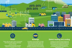
Simplicity in design minimizes cognitive load, allowing viewers to focus on the core message. Avoiding unnecessary clutter, such as excessive labels or decorative elements, ensures the data remains prominent. A streamlined infographic explaining the workings of a solar panel, for instance, focuses on essential components and processes, avoiding extraneous details that could confuse the audience. Simplicity enhances comprehension and promotes efficient information transfer.
- Accuracy:
Accurate representation of data is paramount for maintaining credibility and fostering trust. Visualizations must reflect the underlying data faithfully, avoiding distortions or manipulations that could mislead viewers. For example, a graph depicting the growth of wind energy capacity should accurately represent the data points and scale, avoiding exaggerated trends. Accurate visualizations ensure informed decision-making based on reliable information.
- Contextualization:
Providing context helps viewers understand the significance of the data presented. This might involve including explanatory text, comparing data to benchmarks, or highlighting relevant trends. For instance, a chart showing the decline in the cost of solar energy could be contextualized by comparing it to the cost of fossil fuels, illustrating the increasing economic competitiveness of renewable energy. Contextualization enhances understanding and enables viewers to draw meaningful conclusions.
These facets of clear communication are integral to the effectiveness of renewable energy graphics. By prioritizing accessibility, simplicity, accuracy, and contextualization, visualizations can empower audiences to engage with complex energy data, fostering informed discussions and promoting the transition to a sustainable energy future. Ultimately, clear communication transforms data into actionable knowledge, driving progress in the renewable energy sector.
3. Audience Engagement
Audience engagement is crucial for the effectiveness of visuals depicting sustainable power sources. Engaging visualizations capture attention, foster understanding, and motivate action related to renewable energy adoption. Static charts and graphs, while informative, may not resonate with audiences as effectively as interactive visualizations or visually compelling narratives. For example, an interactive map allowing users to explore renewable energy projects in their region can be more engaging than a static map displaying the same information. Similarly, a short animated video explaining the benefits of solar energy can capture attention and communicate key messages more effectively than a lengthy text description. The ability of a graphic to resonate with the target audience significantly impacts its effectiveness in promoting understanding and support for renewable energy initiatives.
Several factors contribute to audience engagement with renewable energy graphics. Visual appeal, achieved through thoughtful design choices such as color palettes, typography, and layout, plays a significant role. Interactive elements, like clickable charts or zoom functionalities, enhance engagement by enabling users to explore data at their own pace and delve into specific areas of interest. Storytelling techniques, such as incorporating narratives or case studies, can create emotional connections and make the information more relatable. Presenting data within a relevant context, tailored to the audience’s interests and concerns, also enhances engagement. For example, visualizing the potential cost savings of installing solar panels on a residential home can be more compelling for homeowners than presenting abstract data on national energy trends. Furthermore, the platform or medium used to disseminate the graphic influences audience reach and engagement. Social media platforms, interactive websites, and educational videos offer diverse opportunities to connect with different audience segments.
Understanding the principles of audience engagement is essential for maximizing the impact of renewable energy graphics. Analyzing audience demographics, interests, and preferred communication channels informs design choices and content strategies. Evaluating the effectiveness of different visualization techniques through user testing and feedback mechanisms allows for continuous improvement and optimization. Challenges remain, however, in balancing visual appeal with data accuracy and avoiding oversimplification or misrepresentation of complex information. Furthermore, reaching diverse audiences requires tailored communication strategies and culturally sensitive design choices. Effectively engaging audiences with renewable energy graphics is crucial for fostering public support, driving policy changes, and accelerating the transition to a sustainable energy future.
4. Impactful Presentation
Impactful presentation significantly influences the effectiveness of renewable energy graphics. A compelling presentation transforms data into a memorable and persuasive message, enhancing audience understanding and motivating action. The impact stems from a combination of factors, including visual design, narrative structure, and the chosen communication medium. Consider a graph depicting the decreasing cost of solar energy. If presented as a simple line chart with minimal labeling, its impact might be limited. However, if the same data is visualized using a dynamic animation highlighting the cost reduction trend against a backdrop of rising fossil fuel prices, the impact is amplified. This enhanced presentation draws attention to the economic advantages of solar energy, potentially influencing investment decisions and consumer behavior. Real-world examples abound, such as the compelling visualizations used by organizations like the International Renewable Energy Agency (IRENA) to advocate for policy changes and promote renewable energy adoption globally. These presentations leverage impactful visuals and narratives to communicate complex data effectively, influencing stakeholders and driving change.
The importance of impactful presentation as a component of renewable energy graphics extends beyond mere aesthetics. It directly influences how audiences perceive and process information. A well-designed presentation can simplify complex concepts, highlight key trends, and evoke emotional responses, making the data more accessible and memorable. For instance, an infographic explaining the benefits of wind energy might use striking visuals of turbines against a clear blue sky, coupled with concise text emphasizing clean energy generation and job creation. This presentation fosters positive associations with wind energy, potentially increasing public support for wind farm development. Furthermore, impactful presentation enhances the credibility of the information conveyed. A professional and well-structured presentation suggests thorough research and data analysis, increasing audience trust and the likelihood of information acceptance. Practical applications include presentations to policymakers, investor pitches, educational materials, and public awareness campaigns. In each context, impactful presentation plays a crucial role in conveying the value and potential of renewable energy technologies.
Impactful presentation is essential for maximizing the effectiveness of renewable energy graphics. It transforms data into a compelling narrative, enhancing audience engagement and driving meaningful action. While data accuracy remains paramount, effective presentation amplifies its impact. Key challenges include tailoring presentations to specific audiences, balancing visual appeal with data clarity, and ensuring accessibility for diverse viewers. Successfully addressing these challenges requires careful consideration of design principles, communication strategies, and the chosen communication medium. Ultimately, impactful presentation bridges the gap between complex data and informed decision-making, playing a pivotal role in accelerating the global transition to renewable energy.
5. Renewable Energy Data
Renewable energy data forms the foundation of any effective renewable energy graphic. Without robust and reliable data, visualizations become meaningless decorations. The connection between the data and its visual representation is crucial for conveying accurate information, facilitating informed decision-making, and driving public engagement with the transition to sustainable energy sources. This exploration delves into the multifaceted relationship between data and its visual representation in the renewable energy context.
- Data Collection and Processing
Accurate and comprehensive data collection is the first crucial step. This involves gathering information from various sources, such as government agencies, research institutions, and private companies, on topics ranging from energy generation capacity and consumption patterns to the environmental impact of different energy sources. Data processing techniques, including cleaning, filtering, and aggregation, ensure data quality and prepare it for effective visualization. For example, raw data on wind speeds at various locations needs processing to calculate average wind speeds and potential energy output, information then visualized in a map displaying wind energy potential across a region. The reliability of the collected and processed data directly impacts the accuracy and credibility of the resulting graphic.
- Data Analysis and Interpretation
Data analysis unveils meaningful insights hidden within raw data sets. Statistical analysis, trend identification, and correlation studies help uncover patterns and relationships within the data, such as the correlation between solar panel installations and electricity cost savings. Data interpretation translates these insights into understandable narratives. For example, analyzing historical data on carbon emissions alongside the growth of renewable energy adoption reveals the positive impact of transitioning to cleaner energy sources. This interpreted information then informs the design and content of the graphic, ensuring it conveys a clear and impactful message. For instance, a graphic could visualize the reduction in carbon emissions achieved through renewable energy deployment, supporting policy recommendations for further investment in sustainable energy solutions.
- Data Visualization Techniques
Selecting appropriate data visualization techniques is crucial for effectively communicating insights. Different chart types, such as line graphs for trends over time, bar charts for comparisons, and maps for spatial distributions, serve distinct purposes. Choosing the right visualization method depends on the data type and the intended message. For example, illustrating the growth of solar energy capacity over time is best achieved using a line graph, while comparing the energy output of different renewable sources might utilize a bar chart. Furthermore, aspects like color palettes, labeling, and interactive elements influence the graphic’s clarity and engagement. A poorly chosen visualization technique can obscure insights and misrepresent data, while a well-crafted visualization illuminates the data’s significance and facilitates understanding.
- Data Transparency and Accessibility
Data transparency and accessibility are crucial for building trust and fostering informed decision-making. Clearly citing data sources and explaining data processing methodologies enhances credibility and allows for independent verification. Furthermore, ensuring accessibility for diverse audiences, including those with disabilities, expands the graphic’s reach and impact. Providing alternative text descriptions for images and using colorblind-friendly palettes enhances inclusivity. For example, a graphic depicting the environmental impact of different energy sources should clearly cite the data sources used to calculate emissions, allowing viewers to assess the data’s reliability. Transparency and accessibility promote informed public discourse and empower individuals to engage critically with renewable energy information.
These facets of renewable energy data are intrinsically linked to the creation of effective and impactful renewable energy graphics. The quality, analysis, visualization, and transparency of the data directly influence the graphic’s ability to communicate information accurately, engage audiences, and ultimately drive positive change towards a sustainable energy future. A well-designed graphic acts as a bridge, connecting complex data sets with actionable insights and fostering broader public understanding of the crucial role of renewable energy in addressing global energy challenges.
Frequently Asked Questions
This section addresses common inquiries regarding the use and interpretation of visualizations related to sustainable energy sources. Clarity on these points is essential for informed decision-making and promoting accurate understanding.
Question 1: How can visualizations of renewable energy data influence policy decisions?
Effective visualizations can communicate complex data clearly to policymakers, highlighting trends, trade-offs, and potential impacts of different policy options. This can lead to more informed and evidence-based decisions regarding renewable energy targets, incentives, and regulations.
Question 2: What are common misconceptions perpetuated by inaccurate or misleading renewable energy graphics?
Misleading graphics can perpetuate misconceptions about the reliability, cost-effectiveness, or environmental impact of renewable energy technologies. Inaccurate scaling, cherry-picked data, or inappropriate chart types can distort the true picture and hinder public support for sustainable energy solutions.
Question 3: How can visualizations be used to compare different renewable energy sources effectively?
Visualizations, such as comparative charts or maps, can effectively illustrate the relative performance of different renewable energy sources based on criteria such as energy output, cost, land use, and environmental impact. This allows stakeholders to make informed comparisons and choose the most suitable technologies for specific contexts.
Question 4: What role do visualizations play in public awareness campaigns for renewable energy?
Visualizations play a crucial role in simplifying complex information for the public, making renewable energy concepts more accessible and understandable. Engaging visuals can increase public awareness of the benefits of renewable energy and foster support for sustainable energy policies.
Question 5: How can one ensure the accuracy and reliability of data presented in renewable energy visualizations?
Accuracy and reliability are paramount. Data should be sourced from reputable organizations, methodologies should be transparent, and visualizations should accurately represent the underlying data without distortion or manipulation. Third-party verification and peer review can further enhance credibility.
Question 6: What are some best practices for designing accessible renewable energy visualizations for individuals with visual impairments?
Accessibility considerations include sufficient color contrast, alternative text descriptions for screen readers, and clear font sizes. These practices ensure that visualizations are inclusive and can be understood by a wider audience.
Accurate data and clear visualization are fundamental for informed discourse on sustainable energy. Critical evaluation of data sources and visualization techniques is crucial for promoting accurate understanding and informed decision-making.
The following section offers concluding remarks on the significance of effective visualizations in advancing the global transition to renewable energy.
Conclusion
Effective visualizations of renewable energy data are critical for communicating complex information, influencing policy decisions, and fostering public support for a sustainable energy transition. This exploration has highlighted the multifaceted nature of these visuals, emphasizing the importance of data accuracy, clear communication, audience engagement, and impactful presentation. From data collection and processing to the selection of appropriate visualization techniques, each step plays a crucial role in ensuring the effectiveness and credibility of renewable energy graphics. Furthermore, considerations of accessibility and data transparency are essential for fostering inclusivity and building trust. The analysis has underscored the significant impact visuals can have on shaping public perception, driving investment decisions, and ultimately accelerating the adoption of renewable energy technologies.
The future of renewable energy hinges on informed decision-making and widespread public support. Visualizations of renewable energy data serve as powerful tools in achieving these goals. As data becomes increasingly available and visualization techniques continue to evolve, the potential for impactful communication grows. Continued refinement of data visualization practices, coupled with a commitment to data integrity and accessibility, will be essential for harnessing the full potential of renewable energy graphics in driving the global transition towards a sustainable energy future. The effective communication facilitated by these visuals empowers stakeholders at all levels, from policymakers to the general public, to make informed choices and contribute to a cleaner, more sustainable world.


